Reviewed By |
Matthew (MaFt) Morley |
 |
| Review Date |
10th December 2013 |
| Manufacturer |
TomTom |
RRP |
£299.99 inc VAT |
|
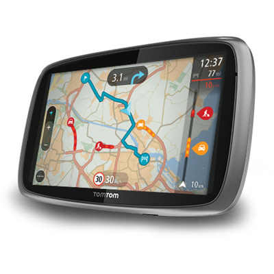
The TomTom GO 6000 is the Dutch navigation stalwart's current top of the range PND. It boasts a massive 6inch screen as well as their latest 'NAV4' software. The 6000 is also one of the two models in their latest batch of GOs (announced earlier this year) that has its own data connection without the need to connect to your smartphone (the other being the slightly smaller GO 5000). So, is bigger really better? Is the new map-centric NAV4 software any good? Can TomTom be forgiven for not including 3rd party POI support (again)?
My first impressions of the TomTom GO 6000 were that it was huge. So huge, in fact, that you can comfortably fit a kitten onto it (I did it but she was moving too much to get a photo - sorry!). To be perfectly honest, it's probably a bit too large - it doesn't really fit into a pocket so if you didn't want to leave it in the car then you'd need a bag of some kind.
I've heard people before now saying that they struggle to read the relatively small text on their satnav and that a bigger screen would be better for them. I'd like to point out that the gigantic 6 inch screen of the GO 6000 would not actually be of any benefit to these people. Granted, the screen is bigger but the display is not simply scaled up - the text on the screen is the same size - you just get more map. So if you planned on getting the large screen because of poorer eyesight or, perhaps, to use in a larger vehicle where it would be mounted further away, then you might want to reconsider.
The GO 6000 features TomTom's latest software, dubbed 'NAV 4', which I actually quite like although it does have a number of shortfalls. The overall look of the software and whole experience is a very refreshing change to what I always thought was a rather aged looking user interface (UI). I still, to this day, get caught out trying to work out how to get to the main menu on older TomTom's before remembering their odd choice to have the user tap the map part of the screen to bring up the menu. With NAV 4 I was overjoyed to see a small button of 4 horizontal dots in the bottom left corner which brings up the main menu. In comparison to being able to tap the whole map to bring up the menu, this button is very small and may not be very easy for those less dextrous than some; but at least it is obvious that there is something you can press.
 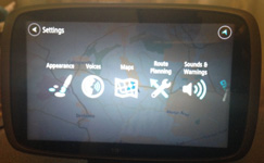
One of the obvious design points of NAV 4 was the presence of the map - you just can't get rid of it. In the menus you have a faded out map visible in the background - there is no practical use to this (we all know that none of us would be navigating the menu screens while driving) but it does look nice. And that is one of the key things with the updated UI - it looks nice; it looks modern. You can tell it has been well thought out and, while I prefer function to eye-candy, I have to say that it does make for a better experience. While I'm on the subject of the menu's it is worth pointing out that the menu structure has been greatly simplified too.
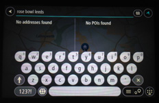
After the totally refreshed look, the next big change is in how you search for your destination. I used to get really frustrated with the older TomTom's, in fact I still do, that searching for an address, searching for a postcode, searching for a point of interest (POI) and searching for a favourite were all separate searches. Even then, when you searched for an address you had to go step by step with the town, the street name, the number... The GO 6000 uses a new method of entering your destination and it is called 'typing'. That's it - just type it. Start typing an address, town, postcode, place name, street, POI type (fuel, shopping, burger) and the matching destinations will be shown on the device - addresses in the left column and POIs in the right. This is so much more user friendly; although other, competing software has had this before. I did find, however, that the searches could be very slow at times even with a fairly specific destination being entered. If you enter a postcode there is still no option of selecting a house number either. It's worth pointing out that there is no live search on the new models either - by 'live search' I mean using the data connection to search on a server for the most up to date POI information. Years ago TomTom used Google Search for this but more recently they set up their own 'TomTom Places'. Some Places data is included in each map update but a live search would have its benefits.
[Please note that there will be a video of the search process here soon!]
'Speak and Go' was a useful feature on older models and this is not available on the GO 6000. This isn't a major issue though due to the improved text input mentioned above.
TomTom have, again, decided not to allow the installation of 3rd party POIs like our CamerAlert speed cameras or our regular POIs. They did this with their NAV3 models and there was a lot of negative press - they did finally add the feature though and, according to a somewhat depressing list of excuses, they intend to add it in the future.
I also found the number and 'special character' (&, é, ü etc) entry on the keyboard slowed things down too. Older devices had a button to switch between letters and numbers but on the GO 6000 you press and hold a letter to bring out a 'pop up' of number and accented letters which you then tap. In the UK this isn't much of an issue - addresses are mostly alphabetic. Thankfully accents on letters such as ä and é are essentially ignored and spelling isn't overly important - so a search for 'st etiene' (with 1 'n' and no accents) correctly returns 'Saint Étienne' in France. American zip codes would also take considerably longer on the GO 6000 than on older models too. If you make an error in your typing you don't have to delete the whole lot, you can now tap anywhere on the word and, much as with most smart phones, move your 'cursor' to delete or add letters anywhere in your current entry.
The GO 6000 also allows you to set a destination by simply browsing the map and then tapping and holding your finger on it. When you do this, or when you select a search result, you get a pop up on the map with a blue steering wheel and the 'menu' icon with 3 vertical dots. The steering wheel is the quick and easy 'Tap and Go' option and the menu gives you a choice of adding to 'My Places' (favourites), use as the starting point, add to the current route or to search near that location. You can add multiple waypoints (255 by all accounts) to a route but there is no way to optimise the route.
In use the routing itself seemed fine, I didn't have any issues with odd routes and, as always, TomTom's traffic service seemed extremely accurate. The 'avoid part of route' feature didn't seem to work; while it was shown as an option in the 'Current Route' menu item it was always greyed out.
 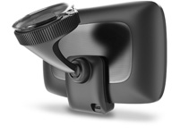
The text to speech quality is OK (but it still can't say "Hull") and the speaker is nice and loud. The included powered-mount is easy to attach, sturdy and, considering the size of the device, doesn't vibrate much when driving. The vivid blue route is easy to see at a quick glance and the spoken directions are well timed. The maps around Bradford and Blackpool seemed up to date although there were a number of incorrect speeds. A few one-way streets were incorrect in Leeds city center as well. TomTom have chosen not to offer their MapShare reporting tool on the 6000 so there's no way to actually correct these errors on the device. You can, however, log in to their MapShare tools to submit them - but this is far from ideal. You can download MapShare updates though. The GO 6000 includes lifetime map updates and lifetime traffic - where 'lifetime' refers to how long TomTom decide to support that particular model and not, necessarily, theactual working life of the device. Still, it's a decent offer - the traffic service is second to none, and the quarterly map updates should, at least, help make up for the lack of proper MapShare support. Ironically the one service you do need to pay a subscription for are the speed cameras. To be fair, the fixed camera locations were accurate (although variable speed limits on a motorway always alert as 70mph) but I never seemed to get any warnings for known mobile sites.
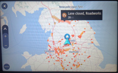
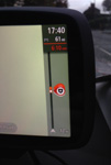
The display on the navigation screen now shows more natural distances to turns showing things like 3/4 mile instead of 750 yards etc. To me this is much better as we are used to seeing road signs, particularly on motorways, marked up in this way. The next turn is displayed at the top of the screen and your current road is shown at the bottom. While you are moving the bottom bar also shows the current road speed and your actual speed. The route bar on the right hand side gives you an overview of your entire route and shows fuel stations, traffic incidents and speed cameras on a vertical line representing the length of your route. If there is traffic half way along your route then the icon is shown halfway up the bar. On the left hand side of the screen you have your zoom buttons but you can also pinch/pull to zoom in and out like on most spartphones. The direction arrow doubles up as a tappable button to switch between 2D 'north up' view and the standard 3D view. 3D representations of buildings are also shown around some areas.
The battery lasted approximately 1hr 20min before the GO 6000 gave a few warnings and then turned itself off. There is no battery level indicator on the main navigation screen and there are no LEDs in the casing to show you it is being charged - both of these make it somewhat difficult to monitor battery usage and plug it in as needed. As such it's best to keep it plugged in all the time - but then this isn't too good for your battery... There is a battery level indicator shown when you are in the menu system but, again, this isn't ideal to have to tap the screen whil driving to see how your battery is.
Apparently no one was using the Twitter, Expedia and Trip Advisor integration of older models and so these have now been removed. The light sensor has also been removed so the day/night mode switches automatically based on time and location. This also means that you are blinded as you go through tunnels and if you turn the device on at night it takes up to 10 seconds for it to get your location and change to night mode - again, leading to a very bright light in your eyes. Personally I preferred the functionality of the built in light sensor as the bright light is distracting.
In conclusion TomTom have made a brilliant effort at modernising their user interface and software - I really do like the new look and feel of it. However, for a 'flagship' device there are a lot of features that have been missed out. So it's a mixture really; what it does, it does well but there are some key features that are missing. It lacks the customisation options of earlier TomTom models - and it is the customisation options that made TomTom so popular in the first place. Perhaps I will regret this last comment in the months and years to come but to me it appears that TomTom are becoming more like Apple with each new product - essentially telling their users how a product should be used and removing any ability to customise.
|