| View previous topic :: View next topic |
| Author |
Message |
GPS_fan
Pocket GPS Moderator


Joined: Jan 04, 2007
Posts: 2789
Location: Hampshire, UK
|
 Posted: Sat Sep 29, 2007 2:50 pm Post subject: Posted: Sat Sep 29, 2007 2:50 pm Post subject: |
 |
|
| mostdom wrote: | I even think the slogan with coffee stain goes quite quite well.  |
Now, that's what I call a blue print 
You even got the eyes crossing the right way and that constipated look on his face, but I didn't go much on the hair 
_________________
Andy
PocketGPSWorld.com supports Help for Heroes - Read here |
|
| Back to top |
|
 |
mostdom
Pocket GPS Moderator

Joined: Jul 10, 2006
Posts: 1964
Location: Surrey, UK.
|
| Posted: Sat Sep 29, 2007 3:14 pm Post subject: |
|
|
Ta very much for the image Gps_fan, exactly what I needed.
It did come out rather blue diddn't it???
Still no clues!
_________________
Dom
HERE LIES PND May it rest in peace.
Navigon 7310/iPhone Navigon&Copilot |
|
| Back to top |
|
|
DennisN
Tired Old Man

Joined: Feb 27, 2006
Posts: 14901
Location: Keynsham
|
| Posted: Sat Sep 29, 2007 4:46 pm Post subject: |
|
|
| GJF wrote: |  2 pints of milk and a dozen eggs please. 2 pints of milk and a dozen eggs please.
I take it you don't deliver but just send the co-ordinates.  |
I get them all from the peasants, so they're quite deer.
No, Dom. I haven't got a clue. Nor an inkling.
_________________
Dennis
If it tastes good - it's fattening.
Two of them are obesiting!! |
|
| Back to top |
|
|
GPS_fan
Pocket GPS Moderator
Joined: Jan 04, 2007
Posts: 2789
Location: Hampshire, UK
|
| Posted: Sat Sep 29, 2007 5:42 pm Post subject: |
|
|
| mostdom wrote: | | Ta very much for the image Gps_fan, exactly what I needed. |
Not a problem - I just went to Google Images and typed "gps satellite" and those were 2 of the images that came up.
It may just be worth double checking though that any image obtained from Google or elsewhere on t'internet are copyright free and therefore eligible for use in the competition.
_________________
Andy
PocketGPSWorld.com supports Help for Heroes - Read here |
|
| Back to top |
|
|
smiley1081
Occasional Visitor

Joined: Mar 08, 2006
Posts: 51
|
| Posted: Sat Sep 29, 2007 7:51 pm Post subject: |
|
|
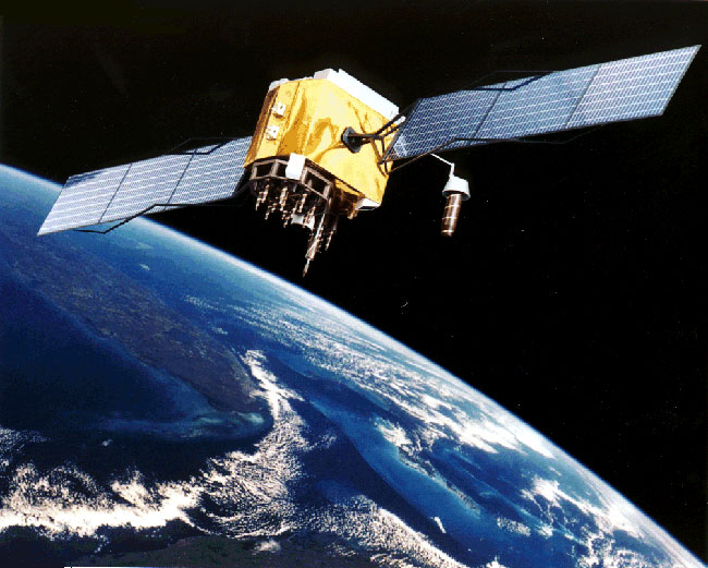
The second maybe looks more modern, but al least the first one is a NAVSTAR satellite...
Here is another model:

As per the logo competition, it's too bad this one is already taken...
 |
|
| Back to top |
|
|
forky
Lifetime Member

Joined: Sep 18, 2005
Posts: 277
Location: Helston
|
| Posted: Sat Sep 29, 2007 9:18 pm Post subject: |
|
|
| strumble wrote: | | mostdom wrote: | Can DennisN's enter.  |
| Quote: | | The logo must be easily recognisable |
Just add his teeth logo as everyone will recognise them! |


_________________
Garmin Nuvi 2699lmt
Samsung Galaxy S9 (o2) contract
Last edited by forky on Sat Sep 29, 2007 9:21 pm; edited 1 time in total |
|
| Back to top |
|
|
GPS_fan
Pocket GPS Moderator
Joined: Jan 04, 2007
Posts: 2789
Location: Hampshire, UK
|
| Posted: Sat Sep 29, 2007 9:19 pm Post subject: |
|
|
I didn't intend to imply that either picture might be better than the other - just giving an indication of the kind of thing that's easily obtainable with a simple Google search.
whatever is 'best' is surely a matter for the individual submitting their design to decide
MaFt expressed an interest and I can't help feeling though that PGPSW staff may be deterred from putting their ideas forward. If PGPSW staff members would like to participate, perhaps their submissions could be judged separately by a panel of members - perhaps moderators or a group of selected members.
If it is decided that the winning member's design is not to be used for the PGPSW logo, it could cost a small fortune to have one designed commercially.
It would be a great shame if a staff member fails to submit a design which might be "the one" and since they wouldn't qualify for the £250, this would give them an opportunity to get artistic and hopefully have a little fun without questionning fairness in the main competition.
Perhaps this idea is a little hair-brained, but who knows?
_________________
Andy
PocketGPSWorld.com supports Help for Heroes - Read here |
|
| Back to top |
|
|
Mowsey
Occasional Visitor

Joined: Sep 30, 2007
Posts: 1
|
| Posted: Sun Sep 30, 2007 7:52 pm Post subject: |
|
|
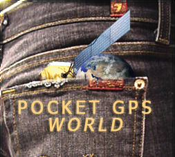
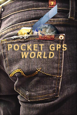
2 Versions, a cropped one and a full size one
 |
|
| Back to top |
|
|
Darren
Frequent Visitor

Joined: 11/07/2002 14:36:40
Posts: 23848
Location: Hampshire, UK
|
| Posted: Mon Oct 01, 2007 8:17 pm Post subject: |
|
|
Mowsey, thank you, the first serious submission.
Mostdom and DennisN, we created the off Topic Lounge, perhaps you should go and sit in it! 
_________________
Darren Griffin |
|
| Back to top |
|
|
mostdom
Pocket GPS Moderator
Joined: Jul 10, 2006
Posts: 1964
Location: Surrey, UK.
|
| Posted: Tue Oct 02, 2007 12:35 pm Post subject: |
|
|
| Darren wrote: | Mowsey, thank you, the first serious submission.
Mostdom and DennisN, we created the off Topic Lounge, perhaps you should go and sit in it! |
I am seriously going to submit an entry, the blue page was a joke! tish... some people take things far to seriously! 
_________________
Dom
HERE LIES PND May it rest in peace.
Navigon 7310/iPhone Navigon&Copilot |
|
| Back to top |
|
|
swanson2
Lifetime Member

Joined: May 17, 2006
Posts: 59
Location: Sedgefield, County Durham
|
| Posted: Thu Oct 04, 2007 11:41 am Post subject: Existing Logo is Fine |
|
|
Hi Robert,
Having survived a number of corporate image, (Logo!) , changes when I was working, I found them to be mostly an expensive "waste of money".
I think that the current PocketGPSWorld.com logo is easily recognisable as a unique trademark, and that I, and many other site users associate it with value for money, reliability and honesty.
I suggest you put the proposed "prize money" to better use by buying the hard working staff of PocketGPSWorld a round of drinks or two at your annual Christmas Party.
Regards and thanks for all your hard work,
Robert Swanson
_________________
I have enjoyed the past, but my main interest is in the future, because I am going to spend the rest of my life there! |
|
| Back to top |
|
|
mostdom
Pocket GPS Moderator
Joined: Jul 10, 2006
Posts: 1964
Location: Surrey, UK.
|
| Posted: Thu Oct 04, 2007 12:41 pm Post subject: |
|
|
Ok. Here goes.
I know they don't look all that different but some have suggested that they like the original so I'm just trying to improve it a little. The main objective here is to introduce a small corparate logo that will fit snug on a cap, mug, sticker, etc. the main heading changes only a little. Even if you diddn't use this, the idea is sound and can be modified to suit the original heading. I didn't do the other icons and stuff as they are just small variations of the same theme.
The two options here are first the small change to the existing header with the logo, and the same again but simpler and updated.
These logos are the wrong size only for the forum and I will send the full size originals in due course.

header 1

cap logo 1

header 2

cap logo 2
_________________
Dom
HERE LIES PND May it rest in peace.
Navigon 7310/iPhone Navigon&Copilot |
|
| Back to top |
|
|
Darren
Frequent Visitor
Joined: 11/07/2002 14:36:40
Posts: 23848
Location: Hampshire, UK
|
| Posted: Thu Oct 04, 2007 12:58 pm Post subject: |
|
|
Hey Dom, nice work, you're forgiven
_________________
Darren Griffin |
|
| Back to top |
|
|
GJF
Frequent Visitor

Joined: Feb 08, 2007
Posts: 894
|
| Posted: Thu Oct 04, 2007 12:59 pm Post subject: |
|
|
It might be a good start if the PGPSW team made a decision on whether the actual design of the satellite is to remain or definitely being changed.
I cannot contribute to the designs as Im not a graphic artist, but as an outsider, I feel the existing satellite design is outdated, it looks like the chitty, chitty, bang, bang car coming into land.
Could the more modern image work better, or go for a simplistic abstract version.
_________________
TomTom Go 60
Garmin Nüvi 660, Firmware v4.90
Drive-Smart GPS with Loader v1.4.16
HTC Advantage X7500 MS 6.1 Tchart Speed Sentry
Satmap Active 10, Software v1.16
Fuzion 32 HUD Bluetooth GPS receiver |
|
| Back to top |
|
|
mostdom
Pocket GPS Moderator
Joined: Jul 10, 2006
Posts: 1964
Location: Surrey, UK.
|
| Posted: Thu Oct 04, 2007 1:08 pm Post subject: |
|
|
| GJF wrote: | | Could the more modern image work better, or go for a simplistic abstract version. |
It needs to be at least satalite shaped! IMO the older satalites with the gold wrap are more recognisable.
_________________
Dom
HERE LIES PND May it rest in peace.
Navigon 7310/iPhone Navigon&Copilot |
|
| Back to top |
|
|
|
![]() Posted: Today Post subject: Pocket GPS Advertising Posted: Today Post subject: Pocket GPS Advertising |
|
|
We see you’re using an ad-blocker. We’re fine with that and won’t stop you visiting the site.
Have you considered making a donation towards website running costs?. Or you could disable your ad-blocker for this site. We think you’ll find our adverts are not overbearing!
|
|
| Back to top |
|
|
|