Reviewed By |
Matthew (MaFt) Morley |
 |
| Review Date |
18th July 2011 |
| Manufacturer |
Mio |
RRP |
£149.99 inc VAT |
|
NB: This device is exactly the same as the Navman Tourer albeit with different branding on the case.
Article Navigation: Introduction | In The Box | Getting Up & Running | First Impressions | Menu Structure | Choosing A Destination | Navigation and The Map Screen | Miscellaneous Extras | MioMore Software | Conclusion
Introduction
I’ve been looking forward to reviewing this device as I’ve never really used any Mio’s and the only Navman I’ve used was a ICN520 from what seems like a decade ago. When I was offered the chance of reviewing a Mio unit I opted for the Spirit 687, one of their top models. I had high hopes for this device, Mio (and Navman) have had a fairly large and faithful userbase down the years so it would be interesting to see how their most recent product stood up to the test.
Even in 2011, not everyone has a computer or, if they do, the will to connect a new device up to a computer to get things set up and running. Because of this I like to review items as they are ‘straight out of the box’. This has previously got me into trouble when I ‘reviewed’ a competitor’s database that came pre-installed on a Garmin device I was reviewing… However, I’m willing to chance it again so this is, predominantly, an ‘out-of-the-box review’ but I will also mention some of the extras that you can get if you connect it up to your computer (although you will have to provide your own USB lead).
   
In The Box
- Mio Spirit 687
- Windscreen mount
- Power lead
- AV Lead
- Quick start guide
- MioMore software & Maps installation DVD (Windows only)
Getting Up & Running
When you first turn on the device you need to activate the relevant maps. This is straightforward - you simply enter the code on the side of the box and it reboots with the relevant maps activated. I had a slight issue that my code only activated 5-digit UK postcodes and not full 7-digit ones. This was a major frustration although I have since been sent a code to activate the 7-digit postcodes - I have been informed though that this does not affect final retail products, only a handful of those sent out for review. I’m mentioning it now though ‘just in case’ it affects other users!
First Impressions
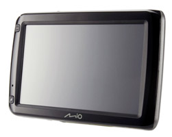
The first thing you notice is that the Mio Spirit 687 has a huge 5” resistive touch screen. The device itself feels quite solidly built but at the same time it does also seem a bit too plasticy (but not cheap).
The mount has a nice little ‘hook’ to keep the cable a bit tidier but attaching the device to the mount can be a bit tricky. Once it’s on it’s also not overly sturdy - the windscreen sucker is immovable though. The power lead, too, has ‘issues’ - it is angled but already feels as though it might break at any moment. The connector is quite bulky and coupled with the fairly heavy cable (that I assume also houses the FM antennaphotos) it exerts quite a bit of strain on the connector. The cable ‘hook’ mentioned previously does seem to alleviate a bit of this but the photos below should show the extent of movement after only minimal use.
    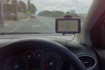
The power adaptor is also huge and may cause problems with neighbouring power supplies if you use a multi-socket adaptor.
As well as the touchscreen there are two hardware buttons on the front and a physical power switch on the top. The top button takes you to the main menu and the bottom one allows you to add favourites / POIs. The power switch is an interesting one; it has three positions: On, Off and Reset. I’m slightly concerned that a company would need to have such an easy to access reset switch - it doesn’t instil much confidence in their software…
Menu Structure
The main menu is nice and easy to navigate, it’s made up of ‘blocks’. The main two are Find and Map and then you have My Places, Settings and Phone as well as a button to take you to the next menu options. The second screen features Explore, Traffic, Trip Planner, Route Simulation, Roadside Assistant, Voice Command and Travel Book. The third and final screen houses Google Local Search, MioMore, AV, Home and Near Me.
  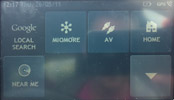
While the menu structure is easy to use it’s not ideally laid out. For example one of the most common uses of any navigation device is to get you home - this should, logically, be one of the first items in the menu but with the Mio Spirit 687 you need to press Menu, then down, then down again and then you can press Home. After a bit of playing I discovered that you can access Home through the My Places option - I’ll admit that having a separate Home button made me assume that it was the only way to ‘go home’. However I also noticed some other duplication for recent destination. You can access it in one of two ways: Menu / My Places / Recent or Menu / Find / Recent Locations. One method would suffice, having two simply causes confusion and isn’t particularly user friendly.
Choosing A Destination (Standard)
Choosing a destination is straightforward. From the main menu press Find and then you have a choice of: By Keyword, Address, City/Area, Coordinates, Postcode, Intersection, Points of Interest and Recent Locations. For entering addresses and postcodes Mio utilise a neat system - if a letter is not available then you can’t press it on the keyboard. For example if I started typing Bradf (for Bradford) then letters such as ‘Z’ and ‘X’ will not be pressable as there are no cities that begin with Bradfz, at least not in the UK!
 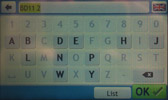
Entering a postcode causes big issues. Now, you may work differently from me but usually I just grab a postcode and house number from Google or a friend/colleague and not bother with the rest of the address. You generally don’t need any more information - postcodes should pretty much refer to a single road. However Mio clearly think differently. Firstly I tried my own postcode which then brought up three street names - this wasn’t actually too bad as my road was at the top of the list. I assumed, initially, that this was showing the actual road at the top and then two nearby roads in case I wanted to go there instead (even though I’d implicitly stated my intentions when I entered the postcode!). However, when I entered my parent’s postcode their street was second in the list of five. I realised then that the street names are in alphabetical order. I know from local knowledge (and a quick check on the Royal Mail site) that each of the streets listed have different postcodes to both mine and my parents - so why are they being shown when I searched for a different one? It basically makes the feature useless, why should I have to choose from five streets when I’ve already stated which street I want by entering a 7-digit postcode?
Anyway, once you’ve phoned your friend to ask them for the street name, you can then enter the house number to confirm the final destination. The destination screen gives options of Explore, Save and Go. Explore pulls up a map and you can manually select a different location simply by tapping. Save will add the address to you’re My Locations folder and, once pressed, changes to an Edit button allowing you to save as your home address, rename or delete.
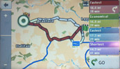
Pressing Go takes you to the routing options. One of the high points of the Spirit 687 is the integration of IQ Routes, which is used for the ‘Fastest’ route. Other route options are Economical, Easiest and Shortest. Tapping one of the options on screen shows an overlay of the chosen route, once chosen you then press Go. If, for example, you selected ‘Economical’ for this trip then next time it will be the pre-selected option on the routing screen.
Coordinate entry is quite unique - and I mean that in a good way. Other devices have you choosing what format you will use either in the settings or before you enter the coordinates. The Spirit 687 allows you to simply start typing and uses it’s clever keyboard again. If you type ’52.’ Then only numbers are available; if you start with ‘52o’ then numbers are available and after typing at least one more number then the minutes (‘) is available and again for seconds (“). The only thing missing is the negative sign; negatives are entered by pressing the N/S button or the E/W button. I have to say it’s the most user-friendly coordinate input I’ve seen.
Points of Interest is always a tricky one to review - accuracy of the data is a major bone of contention. I’ve always found TomTom Map (formerly TeleAtlas) POI data to be shockingly bad. My nearest school is not, actually, 172 miles away, we do actually have a few police stations in Bradford and the location of the White Rose Shopping Centre is way out too. So, poor data aside, how easy is it to find what you’re looking for? It’s actually quite well done. Once you have selected Points of Interest you can choose between Nearby, In City/Area, Along Route or Near Destination (the last two are inactive unless you have a route set). You can then choose By Name, By Type or one of six preset shortcuts (Food, Petrol, Parking, Hotels & Motels, Cash and SOS). Unfortunately it is painfully slow to filter the database to show you the results and pressing the back arrow often does nothing until the device has finished it’s current search. By Type lists all the POI categories including ones you have added yourself (see MioMore Software section later). Once you’ve selected your POI you are taken to the same screen with Explore, Save and Go but also an extra option to call the POI - this obviously needs a phone to be connected via Bluetooth. Even without a phone connected the option is shown - pressing it then informs you that you don’t have a phone connected and will take you through the set up if required. This is a nice touch as you don’t need to cancel what you are doing to go to the main settings to get connected.
If you use the Near Me menu option (third menu page) you can use the same preset POI lists as shown above (Food, Petrol etc). Doing this actually gives different results than if you go via Find / Points of Interest - which defies logic because it’s meant to be searching exactly the same categories from exactly the same location.
Choosing A Destination (Advanced)
The Spirit 687 offers two more ‘advanced’ methods of selecting a destination. These are not shown in the standard Find menu and are, in fact, on the second menu screen. Trip Planner allows multi-point routing and seems to work quite well. It defaults to using your current location as the start point (and this cannot be changed) and you simply press Add to add all the points that you need. The most recent addition is always put at the end as the destination. Tapping any of the points then allows you to move them up or down the list or to delete that part of the route. Edit allows you to optimise the route (while keeping the final destination the same) rename or delete the route. There is a very useful option of “Return to start” too that is missing from many other multipoint routing setups.
The other ‘advanced’ method is Voice Command. This works OK, it’s certainly not as good as the Garmin 3790, there are three button presses (menu / down / voice command) to get to the “hands-free” input method and it needs to be done in fairly quiet surroundings. Even the background noise of a relatively quiet road is enough to throw it off. When entering an address by voice there are no confirmations until the very end. So you have no idea if it has picked up your words correctly. Here’s a great example: I said “Bradford”, “Grasleigh Avenue” and “28”. After saying the house number I got the confirmation screen of: “28, Cropston Avenue, Loughborough”. Just a little bit wrong! Confirmation along the way to say it had ‘heard’ Loughborough could have saved a lot of time as I could correct the city before wasting time with the street and house number.
Navigation and The Map Screen
The default map colour scheme is predominantly grey and white with your route highlighted in green. Initially I thought this was a bit odd and not that helpful. After using it for a while I realised it wasn’t ‘wrong’ in any way, it was just different to what I was used to. It does actually make it easier to see at a quick glance which way your route is taking you. However, it was sometimes hard to see, at a quick glance, which side road you were meant to turn down or drive past. Mio offer you a good selection of other map themes - I eventually settled on ‘Napier’ which was most like the British road colour scheme I’m used to from paper maps.
The navigation screen layout is shown below.
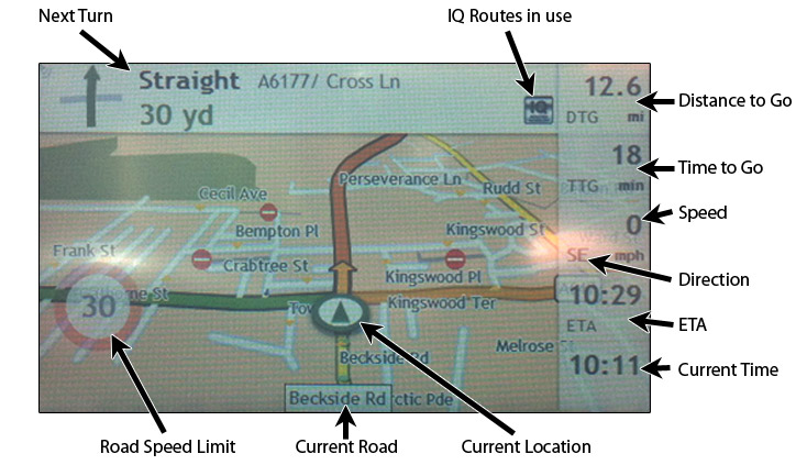
The top bar shows your next manoeuvre and the distance to it as well as the road you will be turning onto. The top right is a user-selectable area - tapping it once displays DTG (Distance To Go), TTG (Time To Go), Speed & Direction, ETA and the current time. Tapping on any one of these closes the list and displays a single choice in the corner. You can, of course, leave the full list on display.
The current road speed is shown on the bottom left and is quite large and unmissable. If you are below the road speed then this fades out but once you are above the limit it becomes opaque and far more visible. This works well as a reminder of the current road speed without it getting in the way all the time as you can still see the map through it.
The routing seems quite sensible with realistic ETA’s. The FM Traffic is a hard one to discuss - I live in an area where FM Traffic signals aren’t that great. On the times where I did pick up a signal there was nothing nearby that I could have travelled to to check it’s accuracy…
There are two ways you can bring up the zoom controls on the map screen. The first is to run your finger over the map and then the +/- bar appears on the right hand side. However, moving the map like this means it stops tracking your location and is no good while navigating. Tapping the map (as opposed to moving it) brings up a Map Options screen which has a button to turn on the zoom level. Two taps just to bring up the zoom controls isn’t an ideal process when you just want to quickly adjust the zoom level. Yes, I know we shouldn’t be doing things like this when driving (I was actually sitting at traffic lights when I was wanting to zoom in to get the detail of the upcoming roundabout) but if there was a permanent zoom in/out button on the map then it would be no more ‘dangerous’ than pressing ‘AM/FM’ on the car stereo to switch to the radio.
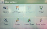
The other options in the Map Options screen are: Volume, Add Waypoint, Skip Waypoint, Detour, Route, Cancel Route and Route Options. These are self-explanatory really so I won’t spend much time on them. Detour allows you to skip 1, 2, 5, 10 or 20 miles of your route (but not a specific road). Route gives you three sub-views: a map overview of the route, an information screen (ETA, Distance travelled etc) and a turn-by-turn list. Here we come across another user-unfriendly feature of the UI. In the Information screen you have to use the up/down arrows to scroll up and down but on the turn-by-turn list you can push/pull the screen up and down with your finger (much like on most modern smartphones) or use the arrows. A bit of consistency would be nice here Mio…! Route Options allows you to choose the road types for the route and toggle a few settings such as Mileage Recorder, Landmark Guidance and Custom POI alerts (none, visual, audible and visual). Again though you can get to these via the main menu in Settings then Route Options.
Sadly, for Mio’s top device, the Spirit 687 is pretty much useless when it comes to actually using it while driving. It’s not often that I pass such harsh judgement on a device I am reviewing but when the core function of the device is crippled then I have no other option. When you are driving and you are given a voice instruction the map freezes for about 10 seconds. At first I didn’t notice this because it would often speak to me at a junction where I was at a standstill. However, on a motorway run when you get multiple instructions the freeze is impossible to miss. Driving down the M606 I got my first announcement, “In 900 yards exit left onto the M62 East”, the screen then froze at that point - the map, my position marker, my speed at that point, the ETA, the road speed… everything! Then I got my next announcement as I approached the actual turning, “Exit left”, and the map still froze. I hit the roundabout coming off the M606 to the M62 and had my next instructions, “At the roundabout take the first exit onto M62 East” and the screen was still frozen on the view from a mile back… It continued… “Exit left” and the same view still. After about 1 mile on the M62 the screen came back to life and showed my current position and details. Now, forgive me for the harsh criticism, but this is terrible! How on earth can you use a navigation device when it doesn’t even show you where you are supposed to be navigating?! Had it been an issue with one of the ‘extras’ then maybe I would let it pass, but for the core function to be so lacking simply makes the device unusable. You can also instigate the map freeze at your own will too by tapping the ‘next turn’ icon at the top left to make it talk again and, like magic, your screen is frozen for around 10 seconds.
The Text To Speech quality is quite poor, often sounding robotic and ‘wobbly’ although the device does have a suitably loud speaker. The inbuilt speed cameras seem fairly accurate and are directional although you do not get mobile sites in them. You can, however, install our own database onto the device using the MioMore software (see later).
When you are driving the Spirit 687 logs all your speeds according to the road type and time of day (in half hour ‘slots’). These are then used to improve on the routes chosen for you. Basically it’s an extension to the IQ Routes used on the device but more personal to your driving style. Obviously this takes a while to build up a full record of your driving styles at different times but it’s a good feature none-the-less.
On the front of the device there is the ‘Add POI’ hardware button. Pressing this while driving will go to an add POI screen. Here you can change it to being a route (i.e. to save a track). It gives a 4-second countdown after which the POI is saved to the ‘My Locations’ area where you can edit it later. Or, if you are at a standstill you can do the editing there and then. This works well as an easy way to create markers (adding speed cameras for example) to edit and submit at a later time.
Miscellaneous Extras
The Spirit 687 allows you to use your phone’s data connection over Bluetooth. This then gives access to Google Local Search and MioMore. As I do not have a compatible device that can work with the Bluetooth DUN (Dial Up Networking) I was unable to test these. The instruction manual gives no hint as to what you can do via MioMore on the device either.
Bluetooth is also used for handsfree calling. This seemed to work well, succesfully pulling in my contacts to the device as well as call history etc. Audio quality was adequte with no noticeable dropouts. While on a call you get a green status bar along the top of the screen which, when tapped, takes you back to the full information screen.
Also included is an AV input (3.5mm jack) so you can add a video feed to the device. You could use this to watch a video on the device or, more realistically, you could feed a reversing camera into the Spirit 687. This isn’t particularly user friendly though as you need to navigate the menu (menu / down / down / AV) to get this to display, by which time you could have already parked. An option to switch to the AV input when a signal is received would be far more useful (for example with a reversing camera who’s feed is turned on when reverse gear is engaged).
MioMore Software
OK, so that’s the device pretty much covered - warts and all. Now, onto the extra stuff, namely the MioMore Desktop Software. The first point to note is that this is Windows only software. The second point is that you need to connect the device via a USB lead - which is not included in the box. While most people will probably have a spare USB cable kicking about somewhere I’m pretty sure that for a few pence extra in cost they could have included one. They did, after all, include an AV lead that I think most users will simply discard!
Within MioMore you can manage your subscriptions (such as to Mio’s own speed camera database), manage the installed maps, purchase extra maps, upload and search for geotagged photos, upload custom POIs, manage your trips, rearrange the menus and manage your trips.
The first thing I did was install the PocketGPSWorld.com CamerAlert Speed Camera Database. This is straightforward and allows you to associate a bitmap and audio file for each file uploaded.
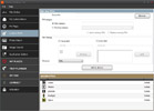
Navpix is an OK idea in theory - you browse through geotagged photos and use those for your destination. The downside is that you need to connect it to your computer to upload the photos (there is no memory card slot). You can also search for geotagged photos using the software and this will download them from Google’s Panaramio. It’s not something I’ve ever used, nor can I imagine I will ever use.
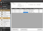
Trip management is useful for business drivers or those simply interested in where they’ve driven. Trips can be viewed and exported for your chosen dates and you can also calculate your rough fuel use too.
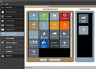
The most useful feature of the MioMore software, and something I would love to be integrated into the device itself, is the ‘Application Gallery’. This isn’t very self explanatory, but each menu option is classed as an application. The gallery allows you to rearrange, remove and add menu items. So my gripe about the number of key presses to get to ‘Go Home’ was instantly removed as I have now moved it to the first page. I’ve also removed the Roadside Assist as it only had options for RAC or AA and I use Green Flag… One odd thing though is the presence of ‘Truck Mode’. Adding this to the menu doesn’t actually do anything; the menu item doesn’t show up. I have seen on some other reviews, particularly in mainland Europe, that they have a truck mode for truck-specific navigation. It looks like this is either not available for the UK version or, like the 7-digit postcode issue, they didn’t activate it for the review sample…
Conclusion
Overall, and I think this will be quite clear from my review, I’m not that impressed with the Mio Spirit 687. It has a few good features - it is easy to use, has a nice big screen, a customisable menu, multipoint routing etc. It also has too many downsides - the map freeze issues make it unusable, the text-to-speech quality is embarrassingly poor and the voice input seems badly thought out. For one of Mio’s high end models it doesn’t put out a good advert for their more basic entry-level models. I was looking forward to reviewing a Mio device and, unfortunately, I feel somewhat let down by the whole experience.
|