by Darren Griffin
Introduction
I've had a Nuvi 760 on loan from Garmin for the summer. Functionally identical to the 710 in all respects other than map coverage, Text To Speech (TTS) and the colour of its case, the Nuvi 760 sits towards the top end of the extensive Nuvi model line up.
Like the 710, the 760 uses the 4.3" screen and has TMC Traffic and FM Transmitter amongst its features. Where it differs from the 710 is in its inclusion of a full Western Europe map and Text to Speech (TTS). Instead of 'Turn right in 500 meters' you get 'Turn right onto High Street' which is a useful addition.
As we took a close look at the Nuvi 710 back in February (see here), I've opted to write my findings as a supplement to that review adding own opinion of some key areas rather than re-hash all that has been covered previously.
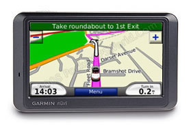
Garmin's 760 sits towards the top end of the extensive Nuvi model line up. Like the 710 it uses the 4.3" screen and has TMC Traffic and FM Transmitter.
Where it differs from the 710 is in its inclusion of a full Western Europe map and Text to Speech (TTS). Instead of 'Turn right in 500 meters' you get 'Turn right onto High Street' which is a useful addition.
In the Box
Open the box and you'll find the following:
- Garmin Nuvi 760
- Windscreen Mount
- GTM21 FM Traffic Receiver / Power Supply
- Dashboard Mounting Plate
- USB Lead
- Leather Case
- Quick Start Guide
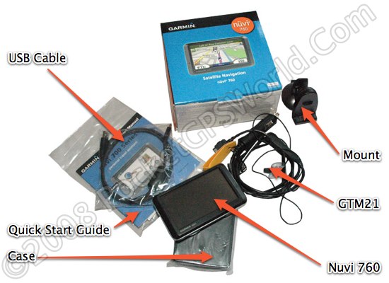
The only obvious omission is a mains power supply but this is far from unusual, few devices include them these days. As it can be charged from a USB port on your computer it's not a huge issue.
So without further delay, let's get it installed in the car and take it for a test drive.
Installation
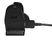 Ok my first gripe, the mount. The ball socket on the rear of the mount wasn't tight enough on my review sample. When installed in the car every bump in the road would cause it to move. The only way around it was to position it such that a corner of the device rested on the instrument binnacle. Ok my first gripe, the mount. The ball socket on the rear of the mount wasn't tight enough on my review sample. When installed in the car every bump in the road would cause it to move. The only way around it was to position it such that a corner of the device rested on the instrument binnacle.
This may be a symptom of a well used and abused press hack device but it shouldn't happen. I'm also not a fan of the GTM21 power/traffic antenna solution. This is very poorly designed with the multi-function power/data connector exiting the mount at right angles and thus placing the weight of the cable directly on the connector. Time will tell if this proves to be a weak point.
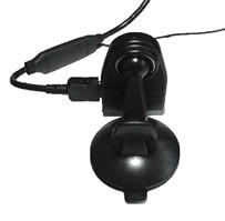 The power/data cable splits at a junction about 2 inches out from the mount so that the antenna for the FM RDS-TMC can be affixed to the windscreen. This again has been poorly considered. The junction is a small plastic package about the size of a USB memory stick further adding to the stress on the connector. The power/data cable splits at a junction about 2 inches out from the mount so that the antenna for the FM RDS-TMC can be affixed to the windscreen. This again has been poorly considered. The junction is a small plastic package about the size of a USB memory stick further adding to the stress on the connector.
Because of the design it's very difficult to install the cabling neatly. I detest unsightly cables and with the mount installed adjacent to the A-Post I was left with the power lead draped over the steering column and a string antenna for the Traffic feature stuck to the glass up the A-Post and across the top of the windscreen.
Affixing the 760 to the mount was relatively straightforward although I did struggle to line up the unit with the two locating pins on the mount more frequently than I would have liked. Removal is a reversal of the installation process initiated by pressing the bottom mounted release button, the sighting of which prevent the unit from being installed with the mount resting on the dash!
Given how important a good mount is it irks me that such shoddy solutions are allowed out of the lab!
In-Use
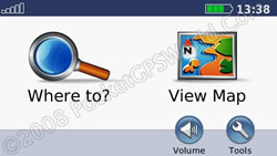 Those who use Garmin devices will know the menu layout. For the key functions it's easy to use with a clean intuitive interface that is easy to navigate and simple to interpret. Those who use Garmin devices will know the menu layout. For the key functions it's easy to use with a clean intuitive interface that is easy to navigate and simple to interpret.
Garmin's solution is not for the tinkerer though. Customisation and other options are limited and buried in obscure sub-menus but for the vast majority it offers a simple, easy to use navigation tool.
When you switch on (after the compulsory message warning you not to use the device whilst driving) you are taken to the main screen as seen on the right. A fine example of a clean and simple interface. Tapping 'Where to?' takes you to the main navigation menu shown in expanded mode here:
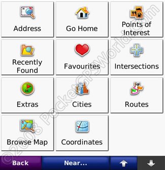
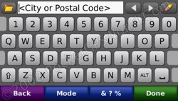
Here you can see all your navigation options, address, home, POI etc. Selecting address takes you to the keyboard entry screen where you can enter the destination city or Postal Code.
The one key area where the 760 differs from our 710 review is in the use of Text to Speech voice guidance. This works acceptably with a rather robot sounding voice. None of the TTS systems are perfect although the best are very much more natural than Garmin's implementation.
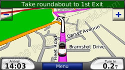 
I'm not going to cover the same ground as our previous review of the 710 but having had the opportunity to use the 760 for some months I'd have to summarise my time with it as frustrating! It's not a bad unit as such, it just lacks features I would have expected in a unit at this price level. It's hard to avoid using the term 'Fisher Price' in relation to it's general look and feel as everything has been simplified so far that it all feels rather toy like.
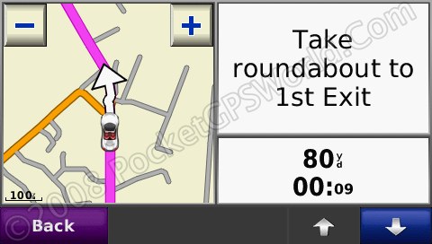
If you take the map display as a case in point. As you can see in the image above left, the very minimum of information is displayed. There is no GPS signal indicator, no journey time, no current speed, no compass. Now none of these taken in isolation are essential but they are all nice to have. Users place deferring levels of importance on each of these but Garmin offer you no options in this regard at all. What you see is what you get.
The little car cursor can be changed, Garmin have a growing selection you can choose from but the image is animated and so they have prevented you from making your own. Quite why it's animated I haven't quite figured out as you rarely see the animation. At junctions you might see a jerky side view of the car as you turn but it adds nothing and is a waste of resource in my opinion.
Specification
| Dimensions |
12.2 x 7.6 x 2.0 cm |
| Display |
9.7 x 5.7 cm (4.3") |
| Display resolution |
480 x 272 pixels |
| Weight |
190g |
| Battery |
Rechargeable Li-Ion |
| Battery life |
up to 5 hrs |
| GPS Chipset |
SiRFStarIII |
Conclusion
I wanted so much to like this device. I started off my GPS career with a military Garmin unit and have been a Garmin user for many years. The Nuvi 760 is a good unit let down by some key issues that I couldn't live with. Although I accept that for the average user it may be a perfectly good solution the poor mount is inexcusable and lack of configuration options is disappointing in a high-end model such as this.
The interface is simple to use for the main functions but some of the lesser used features are buried in sub menus and thus hard to locate. Whilst it is important to display only key information I think the main map screen has been overly simplified in my opinion.
If you're after a solution that makes the main navigation function simple and require little in the way of fine tuning or user configuration then this would tick all the boxes but it's a very expensive solution to that requirement and is matched or bettered by a great many other solutions for less money.
|