Reviewed By |
Darren Griffin |
 |
| Review Date |
17 November 2010 |
| Manufacturer |
TomTom |
| RRP |
£249.99 UK
£279.97 EU |
|
| UPDATE: Since this review was published, TomTom have provided a roadmap for the updates required to MyTomTom to restore missing functionality. Full details can be read here. We wil re-visit this review once the updates have been released and reconsider the overall score. |
TomTom announced the GO 1000 Live to a select audience of investors and journalists at an event in Amsterdam back in May of this year.
The GO 1000 marked a new path for TomTom. This is another LIVE enabled device which is able to make use of the range of LIVE services offered by TomTom. Much was made of the new web kit based software, faster route calculation, new user interface and the capacitive touch screen.
TomTom CEO Harold Goddijn also intimated that the device heralded the possibility of apps with select developers being invited to create add-ons for the platform.
We have been testing pre-production versions since the unveiling but considered it unfair to comment in detail based on a test device. With retail orders beginning to filter through in September we have now received a production version and have been giving it a thorough road test for the last few weeks.
Design
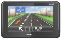
TomTom's devices have shared a common design ethos since they first became available. Although the designs changed considerably they maintained a common family theme. The GO 1000 is a marked departure from this. It adopts a very simple rounded black shell with the front panel taken up almost entirely by the glass display and touch screen. The rear has a brushed metal trim finish with punched holes for the speaker and a small slot that locates it in the mount.
The combined power switch and status light is on the top left and the bottom contains the multi-connector sync/charge port. It's a smart and clean, if rather plain, design that looks modern at the expense of being rather anonymous.
The glass touch screen is glossy and whilst it is much more prone to reflections than previous matt versions the capacitive screen is multi-touch. With a brighter and crisper display as a result it is much nicer to interact with.
The mount is also new and worthy of praise. TomTom have experimented with varying levels of success with active mounts in the past. An active mount differs from a passive one in having power supplied through the dock rather than requiring a separate power lead be connected.
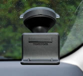 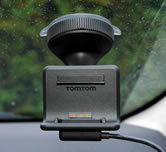 
The power cable clips into the mount -easy to fit and remove
TomTom have opted for a simple mount design that uses magnets to connect the GO 1000 to the mount and a separate power cable that clips into the bottom of the mount and itself uses magnets to lock on to the GO 1000 when it is docked.
This solution gives you the benefits of an active mount (one handed docking with no cables to connect) in a simple design that allows the cable to be easily removed. That's handy for TomTom as it allows them to use the same lead to both charge the device in-car via a small cigarette lighter plug that contains a USB socket and to connect it to your computer when you need to perform an update.

Cigarette Lighter Charger/USB Adapter
One less cable keeps costs down but does mean you have to bring the lead in with you if you need to hook it up to a computer. The connector on the GO 1000 is a proprietary one, you will not be able to use an off the shelf lead.
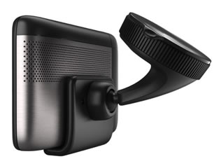 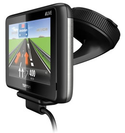
Clean simple design - great mount
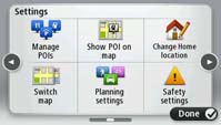
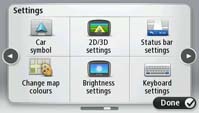
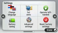
The familiar TomTom interface has had a complete redesign. The menu system employed by TomTom since the very first GO was launched was well thought out and universally liked. Where it did fall down though was in the page navigation.
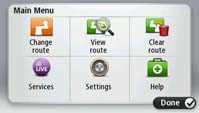 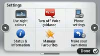
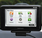
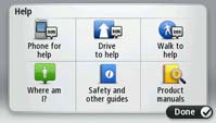
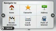
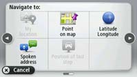
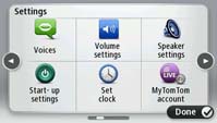
Familiar six option menu layout
As more and more features were added to each new device, more and more pages of settings and options were required and the design was such that you could only move through each page of options in one direction. If you were too quick and skipped past the page you required, you were forced to cycle through the pages all over again rather than being able to go back one page.
So TomTom have implemented a wholly new menu system. The same layout of six menu options per page has been retained but now you can move forwards and backwards through menus and even create a custom menu with all your most often used functions easily accessible.
You can also now use gestures to navigate the menus. Swipe your finger from left to right to advance a page and from right to left to go back a page.
The map display has been re-jigged but still offers all the information you might need in an easily digested easy to read format. This has always been a feature of TomTom that few other devices can match.
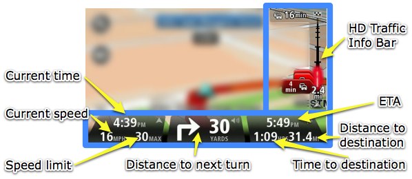
Main display layout
All devices come with 4GB of internal flash memory but there is no memory expansion slot. Another big change is to TomTom HOME which is now called MyTomTom. The new devices no longer mount as a removable disk drive and owners will have no access to the file system directly. MyTomTom is an application that connects your device to TomTom servers directly. All software upgrades, map updates etc will be performed through this application.
The benefits to TomTom are much greater control over the device and the update procedure. It is able to perform incremental updates and can recover from errors during the update process. It will also offer TomTom much greater control over security and the piracy of their data.
It is not improbable to foresee a time when updates can be delivered over the air using the data connection. No longer would we need to hook up the device to a computer. One wonders how many devices there are in use that have never been updated since they were purchased?
Features
Aside from the basic features you would expect of a satnav, the GO 1000 offers the LIVE service package, IQ routes, eco routes, advanced lane guidance, text-to-speech, voice control, quick GPS fix and hands free calling.
Voice control is a welcome feature which worked much more effectively on this device than previous incarnations. To make best use of the feature you need to add the voice control shortcut button to your map screen otherwise it is three screen taps away in the menus.
In use I found it worked well and had no problem understanding a complex Welsh town name. It may be a little slow but is far safer than attempting to interact with the device whilst driving.
LIVE SERVICES
Every device comes bundled with a 1 year free Live services subscription. After the free period is over, a subscription is required with various options available, e.g. 1 Year £47.50. The GO 1000 does not offer Fuel Prices in the package unlike previous models. It may be that this service is being dropped across the board?
Live services provides:
- HD Traffic
- Mobile Speed Cameras
- Google Local Search
- Weather
Clearly Google Local Search and HD Traffic are the headline services in the bundle. HD Traffic is TomTom's innovative service that uses a mix of road network data, incident reports, floating vehicle data from other Live enabled devices and data from Vodafone network users. It is technically the most superior traffic service available and, on paper at least, it should be a winner.
The benefits are obvious. By having access to up to date traffic speed information and traffic incidents, jams etc, TomTom are able to calculate more accurate journey times and offer you alternative routes if they would be faster than the one you are on.
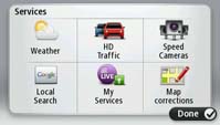 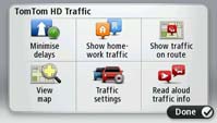 
 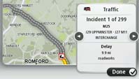
HD Traffic
Because they have access to a vast quantity of data from other TomTom Live devices and Vodafone customers they can create very accurate traffic maps. When the system works it works very well but it is not perfect and on a number of occasions I have found myself sat in nose to tail traffic with the system blissfully silent. Such issues are frustrating and result in a loss of confidence in the data. I would be very wary of accepting a re-route on that basis. How can I be sure that the traffic issue it is avoiding even exists?
Where it does succeed for me is in journey planning. I can fire up the traffic map and see what issues are on my route. Using that knowledge I can decide whether I should set off now or postpone until an incident clears or rush hour subsides.
The inclusion of Google Local Search provides you with the ability to navigate to a location even if you do not know its address or have it stored as a favourite or POI. Now you can enter a search term and have Google pass the resulting address as a destination to the device. It can be a little slow at times but it is very welcome.
Route Calculation
A big change in the method TomTom use to calculate routes has seen first light on the GO 1000. Instead of having to calculate a route from scratch which can take a minute or so for very complex, lengthy routes, TomTom have added a data file to these devices that contains pre-calculated routes.
This was created using a bank of servers that computed a dizzying number of possible route options. The resulting data was compressed and refined and exists as a data file that the device uses to speed up route calculation.
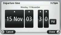
This does seem to make a big difference to the time it takes to calculate a route albeit it is not as quick as was claimed at launch. But it does have a number of benefits. Now, when pre-planning a route from the comfort of your sofa, you can experiment with earlier or later departures and easily see if doing so would reduce your journey time.
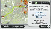 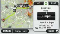 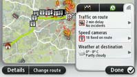
Route Summary with options to alter time of departure and check traffic on route
Another benefit is that, if the unit detects a traffic issue on your route and offers you an alternative, it is able to look ahead and recalculate the entire remaining journey to take into account the deviation. Previous models would navigate you back to the original route once the traffic issue had been passed which may not have been the optimum overall route if the traffic issues were considered.
Custom/Third Party POIs
One of the biggest disappointments has been the omission of third party POI support. Unlike every previous device, the GO 1000 (and the 1005 and VIA models) lack third party POI support. You cannot install POI collections offered by various web sites including ours, nor can you install a third party speed camera database.
TomTom have said that this omission is a temporary issue, brought about as a result of time constraints in getting the product ready for launch. It's an honest admission by TomTom but one which leaves the models handicapped for the time being. TomTom have promised POI support will come to the platform sometime in 2011.
Omissions
The GO 1000 lacks a number of features that were present on previous models. It no longer offers a music player, picture viewer, FM Transmitter or Itinerary functionality. Music and photos may not be considered essential in a navigation device but the FM transmitter and Itinerary were both popular features and it is surprising that a new model should omit them.
Also on the 'missing in action' list is Bluetooth audio output. Line out is available but requires that you buy the accessory dock.
MyTomTom is also as yet unable to perform some basic functions such as backups, speed camera updates, map updates or voice downloads.
Verdict
The GO 1000 is a mixed bag. There is a lot to like. The new route calculation engine, the new touch screen, the excellent mount and the simplified user interface are all excellent.
But it's notable more for what is missing than what it offers. For a premium device to have less functionality than its predecessor is odd and the omission of third party POI support is remarkable and it offers little over its predecessors and competitors.
The GO 1000 has an air of a work in progress about it and should not have been launched with so many features missing or as yet incomplete and unavailable. The MyTomTom application offers the bare minimum functionality possible to support the device, the ability to deploy software updates. I'm sure TomTom are working hard to have it support all the functions expected but they really should have been available at launch.
If you are in the market for an upgrade then you may be better waiting for this range to mature. If you are a first time buyer then this may fulfill your needs but you may find it wanting in some areas.
Screenshots
All thumbnail screen-shots and images in this review are clickable
Specification
| Dimensions |
127 x 80 x 19mm |
| Display |
4.3"
16:9 Capacitive wide screen |
| Display resolution |
480 x 272 pixels WQVGA |
| Weight |
220g |
| Battery |
Rechargeable - up to 2hrs quoted life |
| Memory |
4GB internal flash |
| Connectivity |
Live enabled
Bluetooth |
|